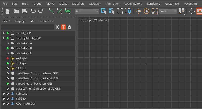
Inspired by the design work done on Maya 2016, Canada-based designer Han Han Xue did a case study of a redesign of Max’s user interface. Consistency, simplicity and clarity were among the main goals. More on Han Han Xue’s website.


CGPress is an independent news website built by and for CG artists. With more than 15 years in the business, we are one of the longest-running CG news organizations in the world. Our news reporting has gathered a reputation for credibility, independent coverage and focus on quality journalism. Our feature articles are known for their in-depth analyses and impact on the CG scene. “5 out of 5 artists recommend it.”
Looks nice and clean and very pleasing to my eyes. But it`s also still 3dsmax.
Nice work!
Nice idea man!
Would love it!!
Well, I hope Autodesk follow this! Looks great!
Actually it lloks exactly like MAX except for distinct icons and maybe a small UI mod but I am not impressed and I would rather have them icons left un touched.
I am a huge fan of the intent (and it is great to see people think about the future of max this way), but agree with @Nir and @3DSMAX HEAVY USER (on the linked site), it does seem a bit cosmetic. I personally think the crisis for max (and it’s dev team) is that the command panel is “fundamental” to what we know as max, hence why (IMHO) most recent major UI additions have been as tacked-on elements/areas.
really nice the guy made the effort, competent too, not sure i dig the vibe though. i get a whiff of cinema4d.
the maya gui refresh was actually well done. hope something similar is in store for max. max ui overhaul is long overdue. its a buggy mess actually.
Looks nice!
I like where this is going
Nick Moutafis (RealtimeUK) made a similar UI re-design, following what he likes about the tab-based layout from Unity.
https://www.facebook.com/photo.php?fbid=10155958653960181&set=p.10155958653960181&type=1&theater
I really like his design even better, because I feel Cinema 4D is similar to this and I find C4D UI to be great, easy on the eyes and very open to customization.
Any backup of this? Link is not working!
Looks fantastic very maya like i love it