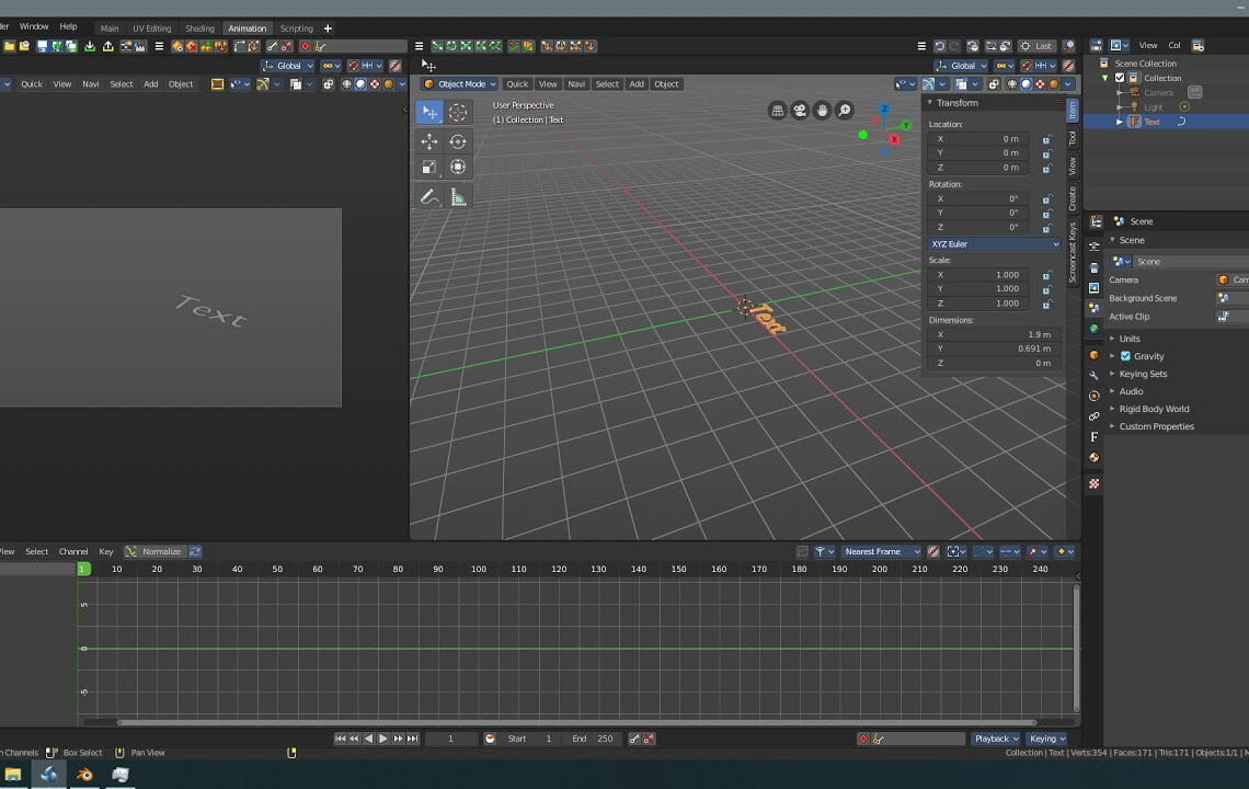
The Bforartists team has announced the release of Bforartists 2, a fork of Blender that has the goal of improving its graphical UI and usability. There are several differences between Bforartists 2 and vanilla blender including:
- A new keymap, which is reduced to just the necessary hotkeys and navigation that can be controlled purely using a mouse.
- A cleaned-up UI with lots of unnecessary double, triple or even more repeated menu entries removed.
- An extended UI that adds a lot of hotkey only tools to the menus
- A rearranged UI to make some things more accessible now.
- Double the number of icons than you would find in vanilla blender and with more colour.
- A configurable Toolbar with icon buttons.
- Improved Layouts.
- Left-aligned checkboxes and text where possible.
- Better Tooltips.
- A more readable standard theme.
- Some add-ons to improve usability, like a reset 3D View add-on or a Set Dimensions add-on with which you can scale in world coordinates
in edit mode. - Much more.
Learn more and download from the Bforartists website





Very nice fork with a ton of useful features and streamlined workflow! I hope the guys from blender will appreciate your work some day and implement all the nice stuff into vanilla version or even hire you to do it 🙂 Keep up the good work!
Thanks 🙂
Bforartists was a dumpster fire even in 2.7 times, and is even more pointless now in 2.8 times. All the guy did was overbloat the UI with random icon shortcuts to some of the tools, many if which are then present on even more duplicate places. There’s nothing making this “for artists” any more than the official Blender builds are.
Hm.. yes, with Blender 2.8 I don’t see the need to re-invent the wheel at this point. With 2.8 the UI got much better, in terms of both look and usability. Bforartists uses icons that actually makes it feel dated.
“Bforartists uses icons that actually makes it feel dated.” true… New blender 2.8x UI is fantastic and it doesn’t need to be double rebuild/re-invented
Been using this for years, and this in dev builds when I could. The polish and details and colour icons has made every day Blender chores into a pleasure. Even in the 2.8 age.
Thank you so much! Vanilla Blender still has lots of UI work needed to fix even at 2.90. It’s still far behind something like C4D. Bforartists 2 definitely makes the gap smaller.
They surely put a lot of work and sweat and tears into this project. My personal opinion, since Blender 2.80+ the UI topic has changed a bit. Now Blenders UI is still ‘unique’, but far more usable than pre-2.80. What I personally would wish is a project that gives Blender a UI (and hotkeys) that specifically match the defaults of other software (Maya/Max/Cinema/…). For me this would be a much bigger help transitioning to Blender.
Anyway, nice project !
… that would be awesome having Max hotkeys in Blender…
Maybe a suggestion for bforatists? Thanks anyway 🙂
There’s already a keymap setting in Blender preferences called Industry Compatible.
Yes, I know (and use) this Industry-Compatible setup. And yes, this feels much more intuitive to me, similar to 3ds/MarvelousDesigner/SubstancePainter….but of course I’m dreaming of ONE setup that is consistent through all apps. Right now, the Industry-Compatible feels like “one more interface setup to learn” (but somehow easier to learn than the default/original Blender-setup. Of course only because I’m coming from other tools to Blender, I guess.)
So again, just dreaming of 1 consistent interface through all apps….or even 1 app for everything (where I surely could imagine that Blender is getting very close to such an all-in-one-tool, would be great !)