Introduction
[specs-box]
This year Autodesk has released version 2016 of its 3D Swiss Army knife application. 19 years after its initial release in April 1996 (or 25 years, if you want to count all the way back to 3D Studio),
the software is still going strong. Other 3D software, however, have grown in capabilities and popularity on the side, offering stronger competition. Be it motion graphics, Archviz, video games or VFX, 3DS Max is not alone.
Before the launch of 3DS Max 2016, Autodesk made sweeping changes to their business model and software
line-up. They have retired Softimage, removed the option for customers
to upgrade their software to new versions and announced a ‘rental-only’
business model. At the same time, the future of 3DS Max has been seen
with uncertainty due to frequent changes to the product’s management
team, lack of marketing focus and a string of lacklustre releases,
which left many user-voted requests unimplemented for years. Following increasing complaints from
users, a new management team was appointed, headed by core Max users, and, notably enough, joined by the original developer of the 3D Studio software. These changes have significantly raised hopes for renewed development.
It is in this particular context that many will
evaluate 3DS Max 2016 and its feature list. Announced as the “Biggest
Max Ever”, this is the first full release
backed by the newly formed development team. Has development rhythm
gone back to a fast pace, bringing useful features and
reassuring users that 3DS Max will continue to evolve, or is this
another lacklustre release that pushes Max users to
look elsewhere?
Let’s find out.
First impressions
The 3DS Max 2016 experience begins with software installation
and it’s at this point where many users will be first
disappointed. Max has two main issues with its installation
that have not been addressed in years; there are too many files being
installed and there are very limited options for customisation.
Autodesk Material libraries, Mental Ray and over 40,000
‘Populate’ data files are still mandatory installation components.
There’s a lack of advanced installation and deployment options, and
migration of previous user settings is a very manual process. At least
the installation and activation process for the average user is smooth
and simple.
Starting up the software for the first time gives the user the
first notification that something has changed – the “Design” variant
has smartly been retired and 3DS Max has been unified into a single
offering once again. All functionality remains and the user is now
prompted with a new classic/design dialog that lets them initialise 3DS
Max with the settings they’re used to.
After choosing their preferred flavour of 3DS Max, users are
then treated to a newly designed welcome screen showcasing the
“templates” feature which will likely be glossed over and then closed –
at least initially. Now, we are finally presented with the interface.
No matter if you’re a Veteran or first-time user, the UI is going to
disappoint. Compare the 18+ year old 3DS Max interface to Maya 2016’s
sleek new Hi-DPI UI and Max’s classic win32 UI flickery cracks are
really starting to show.
Viewport improvements
The initial standout improvement is definitely the new
Viewport selection preview. Seemingly inspired by Unreal Editor 4, 3DS
Max now makes object selection easy – giving visual previews of objects
under the mouse cursor and objects that have been selected.
The Nitrous viewport has also received another yearly step-up
in performance and visual fidelity, one of the most welcome features
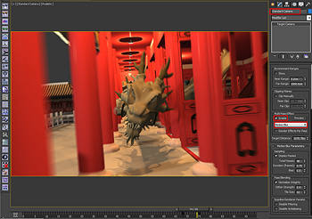
being viewport motion blur – a feature that appears to be omitted from the release notes and
marketing.
Max Creation Graph
The most exciting feature Max has had in years and certainly
the scene stealer of this release, Max Creation Graph
(MCG) allows users to create their own modifiers,
utilities and geometric objects with a node based interface similar to
the Slate material editor. Users can easily export, share, install and
maintain Maxtools made with the MCG system.
Softimage users will definitely be rolling their eyes as they
try out MCG and read the scores of positive feedback from 3DS Max
users. Yes, it is terrible that Autodesk has abandoned arguably their
most modern DCC app, yes ICE is better than MCG, but no 3DS Max user
will be complaining that a node based creation toolkit is being
implemented. MCG is definitely not as good as ICE, particularly in
MCG’s lack of speed and real-time feedback to changes in the graph, but
for a v1.0 release, it is impressive.
Elara Systems has freely released 5 powerful MCG tools complete with video tutorials
Programming experience is definitely a huge plus when diving
into MCG, however even the most non-technical user benefits from Max
Creation Graph via the tonne of modifiers, utilities and tools that
have been freely released in the past month alone. These tools are
extremely easy to package & install and Max users have begun to
oscillate around MCG. In the few weeks since launch, Autodesk has
produced a number of free MCG training videos and released a sample
pack containing 30 MCG tools and 80 compounds. The 3DS Max community
has also created a number of fantastic tools, many are incredibly
inventive, useful and released for free. With MCG, there is an
excitement around 3DS Max that hasn’t been felt for a few years.


