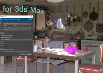
(Update) Two new videos posted showing caddies in action (1 – 2).
New videos showing upcoming developments for Max have been posted on You Tube. These include object painting capabilities, 3D Painting features and render surface improvements, and “caddies” for soft selection. More at Ken Pimentel’s blog.
Max XBR sneak peek videos


CGPress is an independent news website built by and for CG artists. With more than 15 years in the business, we are one of the longest-running CG news organizations in the world. Our news reporting has gathered a reputation for credibility, independent coverage and focus on quality journalism. Our feature articles are known for their in-depth analyses and impact on the CG scene. “5 out of 5 artists recommend it.”
I hope the object painting is really flexible also for animation, something like an advanced Clone modifier with fully animatable tracks.
Overall it’s strange to see the extension of the very unreliable Ribbon-UI…
My problem is not with the tools set but with the UI layout. There has been a unfortunate trend in monitor design compounded with bad ui design in the last few years. This new “Ribbon” is a good example of my disappointment.
Monitors, laptop more then desktop have been proportion to accommodate movies 16 x 9 ratio “HD”. There’s much more width then height to modern screen real estate. With the introduction of the microsoft “Ribbon” bar in Office 2007 we lost even more vertical work area. This is not just on the PC, I see so many users pay extra for a large screen Mac only to lose 10% of it to the DOC.
With the introduction of 3ds Max 2010 ui once again we lose more vertical workspace. Sure you can un-doc it but it’s inability to shuffle the ui components results in a floating doc that just doesn’t work. Why leave the “Command Panel” architecture? ( that’s the right hand side interface). It’s long in the tooth sure but it’s a GREAT proven ui. Again if I was the head of ui design I would fix and improve what works not throw a left curve.
As ui design go’s there’s the worry of density, to much is a No No. Sure if your building an app for the general public. But Max is for professionals use to the complexity of dense interfaces. What Max excels at is customization. With little knowledge one can really tweak the ui to there liking. I would encourage Autodesk to make all tools fully, easily customizable and let the community shape the work environment.
viva la max
Good point … funny thing is that the original PolyBoost had a very clean, minimal UI … Let’s hope for the best, as othoap said it’s a professional tool and not something you will run your stylish netbook to impress your friends with!
I miss the original polyboost, it made my max viewport almost perfectly 16:9, took up no space, and everything was easily accessible. If I could still install it somehow I would. 3ds Max needs to adopt a ui like Nuke; so many of my issues would be solved if I could just move things around a bit…
Just an FYI in case you aren’t aware…you can toggle the orientation of the ribbon to be vertical, float it, or dock it the left or right of the viewports. I personally prefer a vertical, left-docked ribbon over the default. I also prefer the “ame-light” color scheme over the default dark because the icons regain their color, which in many cases distinguishes them or communicates information that is lost in the monochromatic versions.
I’m not disagreeing with the points raised above and I do feel the original polyboost gui was much more concise & efficient. Another pet peeve of mine is that with the original PB gui, there were handy “i” help dialogs for many of the tools that could be opened and used a a reference for hotkeys to alter their function. That information is in the ribbon now, but in a tooltip that takes a few seconds of mouseover to open and then vanishes when focus on it is lost.
I haven’t been able to vertically align the ribbon at all. I guess it’s in the manuals somewhere?
My reseller has this intriguing list of Max 2011 features:
http://www.infinity.no/autodesk_nytt!.htm
Couldn’t find them anywhere else on the web. I wonder what goes into the term “Slate Material Editor”?
@superrune – check details here: http://www.infinity.no/pdf/3ds_max_2011_whats_new_brochure_a4_us.pdf
Great news, thanks for the tips!