Unity has announced an overhaul of its branding to better reflect the fact that the company now comprises more than 50 products and services. Read more on the Unity blog.
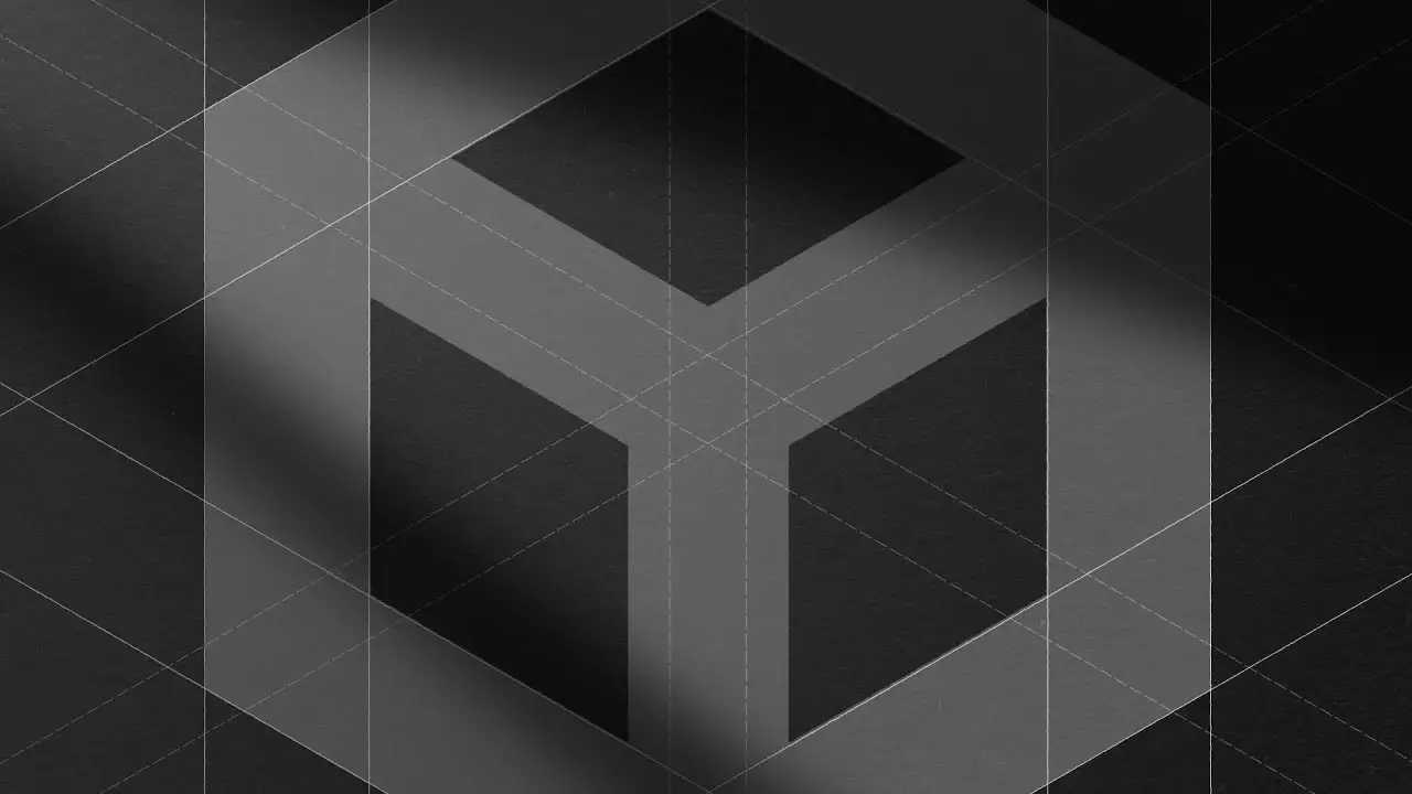
Unity announces new branding
Related Posts


CGPress is an independent news website built by and for CG artists. With more than 15 years in the business, we are one of the longest-running CG news organizations in the world. Our news reporting has gathered a reputation for credibility, independent coverage and focus on quality journalism. Our feature articles are known for their in-depth analyses and impact on the CG scene. “5 out of 5 artists recommend it.”
sorry for my honest opinion, this looks like a shit
No problem, because this is just your opinion.
not just his …
respons to the redesign is mostly negative, as far as i can judge
and i tend agree too
I think it looks pretty much same as the old one.
Agree, ugly redesign, now it looks like a Sci-Fi fascist government flag LOL
fascist government? how you can see something like that.. 😀 whaaat? lol… i think its pretty much identical with old one.
Search that term in Google and you will see what I mean.
Anyways, it’s just an opinion, and it’s just a logo, if you like it, good for you 🙂
I’ll add a hammer for you in the middle if you want you could put the sickle.
“It can be clearly discerned that the reformulation embodies a desire to elevate a minimal, orthogonal response from the ‘executive’, whilst yielding baroque elements of the familiar to the perpetual dichotomy presented by static and dynamic forces acting upon the brand”
Personally I like its punchiness. A tad less friendly and dynamic than the old one, but maybe they want to strike a more serious tone. Obviously I have zero clue about graphic design though.
Yes you have zero clue about graphic design.
Aye, that’s why I wrote it – I wasn’t being sarcastic at the end, just talking as a consumer in the last paragraph. Maybe we disagree, its only a logo after all. So no harm if its a bit pants.
Hopefully its obvious the first line was utter bull. Just a little p-take on the pretentious nonsense that I’ve sometimes had to put up with in design.
Enjoy your day..
Don’t bother with that troll, some are still wondering if he’s a AI bot taking words turning them into troll sentences.
Ok cheers.. I don’t invest much energy or time online, so its all good. His card is duly marked (assuming male).